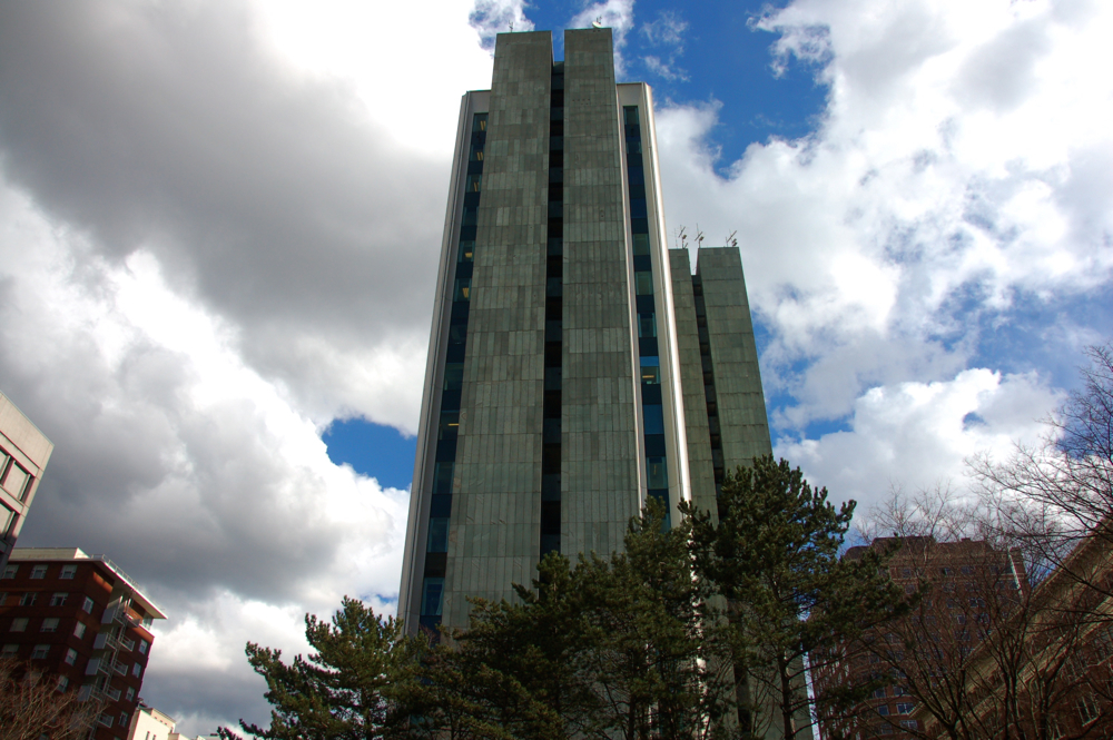
I had the opportunity recently to do a research project on the Bank of California tower for a PSU architecture class. Designed by Anshen & Allen in the late 60s, the building is an excellent example of International Style modernism. True to form, it pays no heed whatsoever to its surroundings, but, in the process of committing that architectural sin, also manages to be quite beautiful in an alien sort of way. Buildings like this tend to give me mixed emotions. To begin with, this block once was home to two theaters, the Liberty and the United Artists, and to one of Portland's many early department stores, Rasmussen's (before that, it was the site of our first public library, which also housed the earliest incarnations of the Portland Art Museum and Oregon Historical Society). But by the time the Bank commissioned this building, only the building housing Rasmussen's was still standing. In a pattern repeated again and again across downtown, the other buildings had been demolished to make way for surface parking lots.
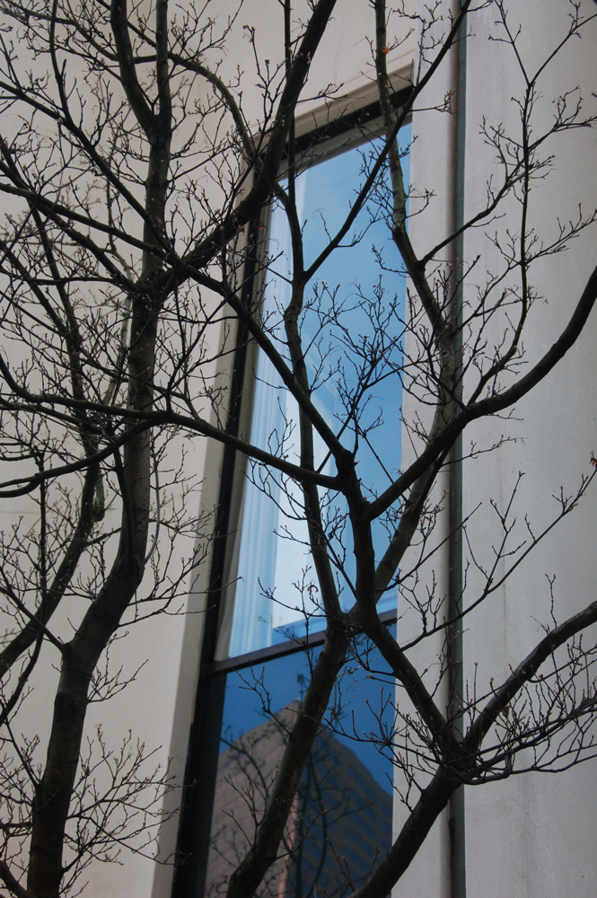
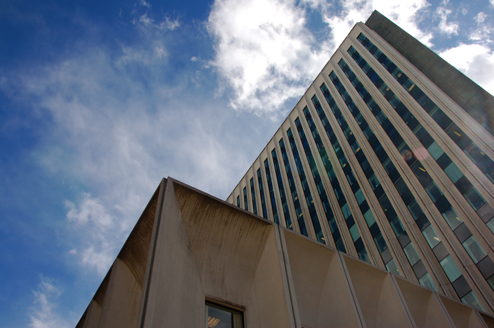
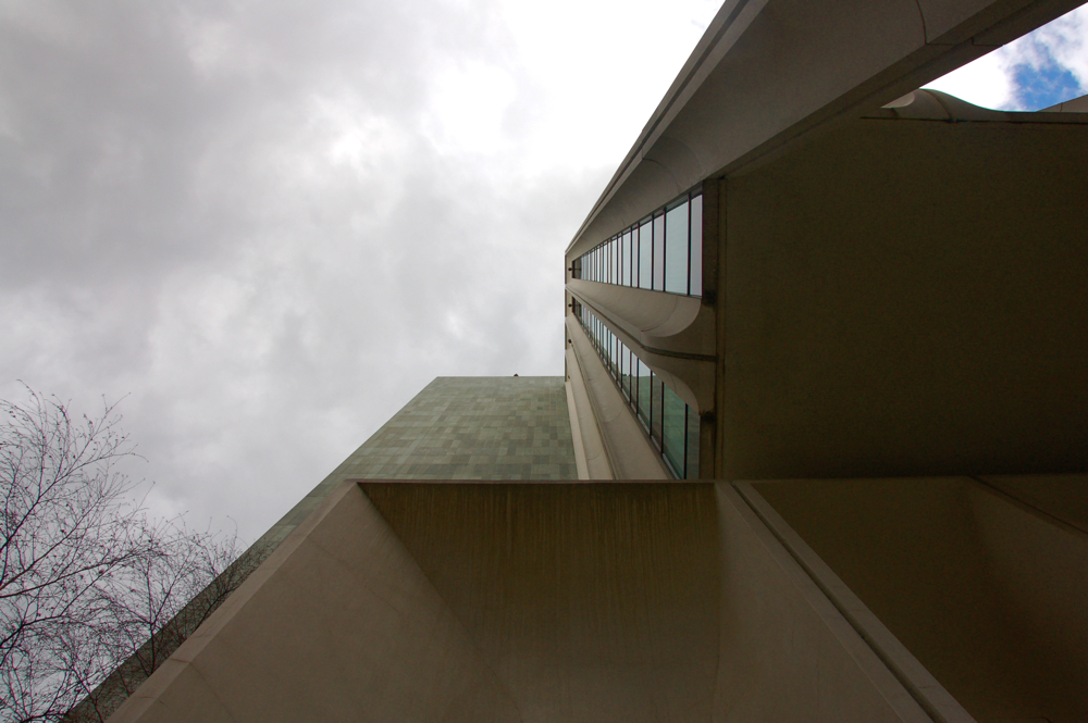
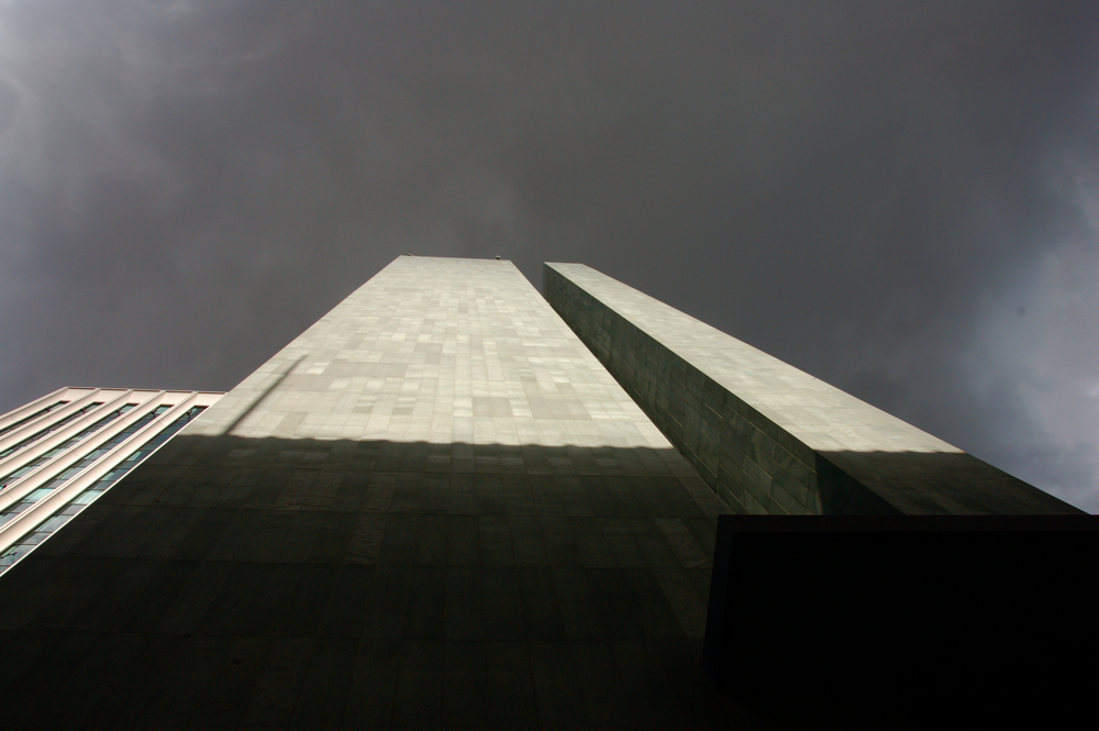
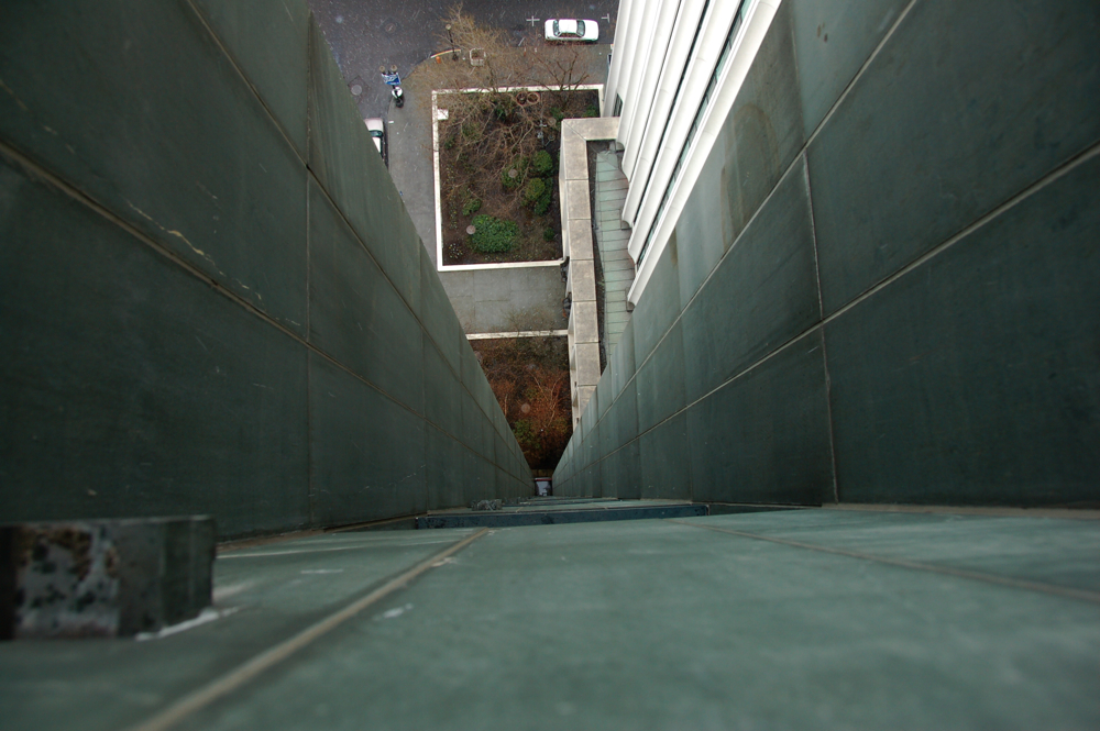
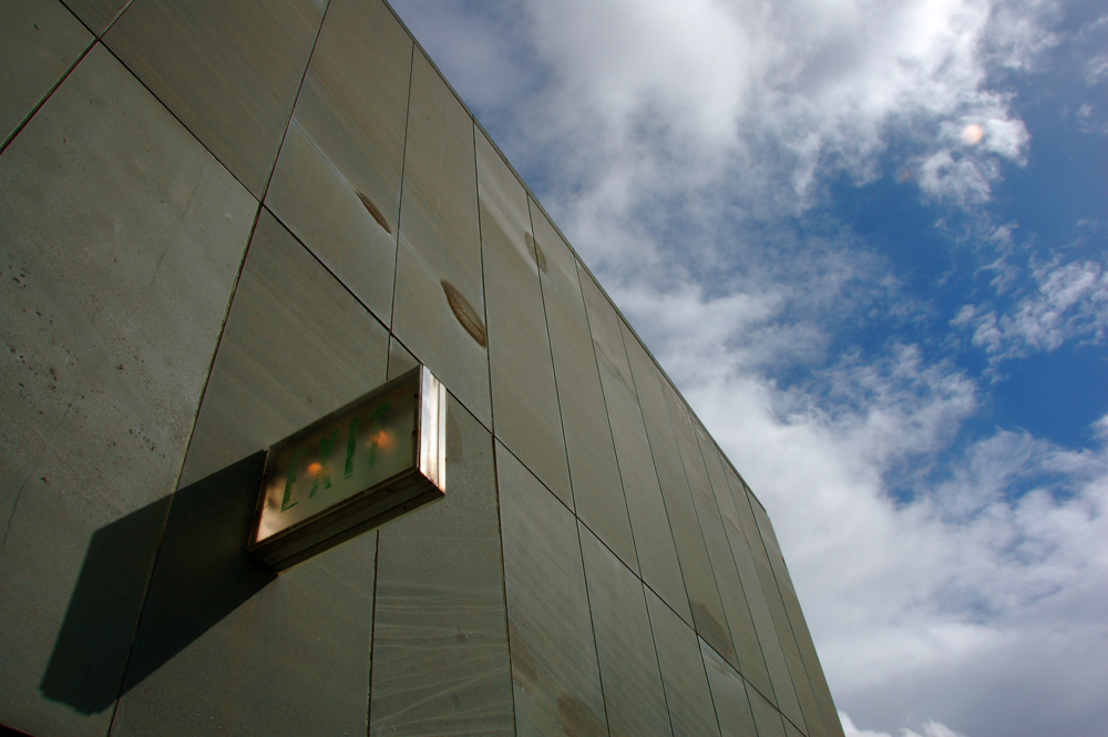
The least successful aspect of the building is where it meets the street. A combination of blank walls, imposing entrances, no retail, and a large parking garage entrance right on Broadway. It's the sort of building that you usually just go around as a pedestrian. Anshen & Allen actually went through the trouble of placing a nice fountain inside the parking garage, something the NYT critic Ada Louise Huxtable referred to, in a withering critique of early-1970's Portland, as having "a kind of ludicrous logic" in that age of auto dominance. If you take a moment to look up, though, and think about the tectonics of the building... well, your heart may soften a bit: the way the tower straddles the base, the juxtaposition of concrete, glass, and tile, the 700 tons of slate on the exposed service cores that forms its own abstract pattern. There is a seductive grace to the way in which the various parts of the structure fit together.
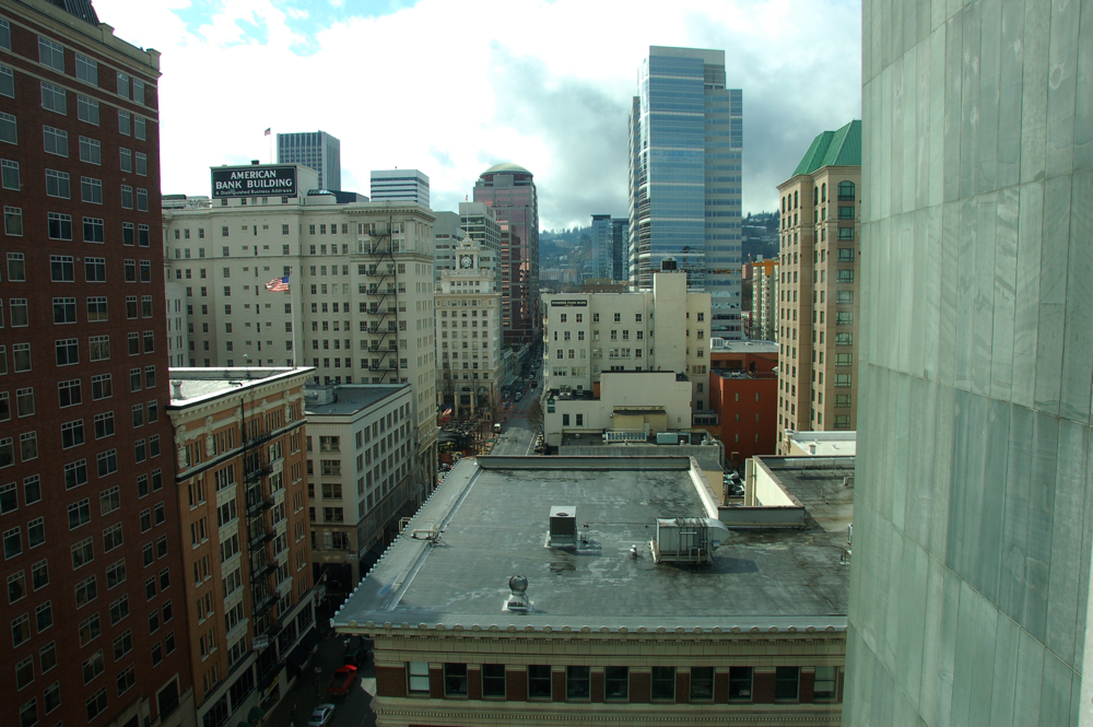
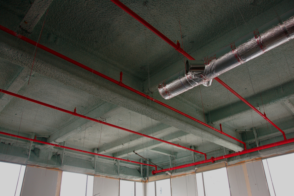
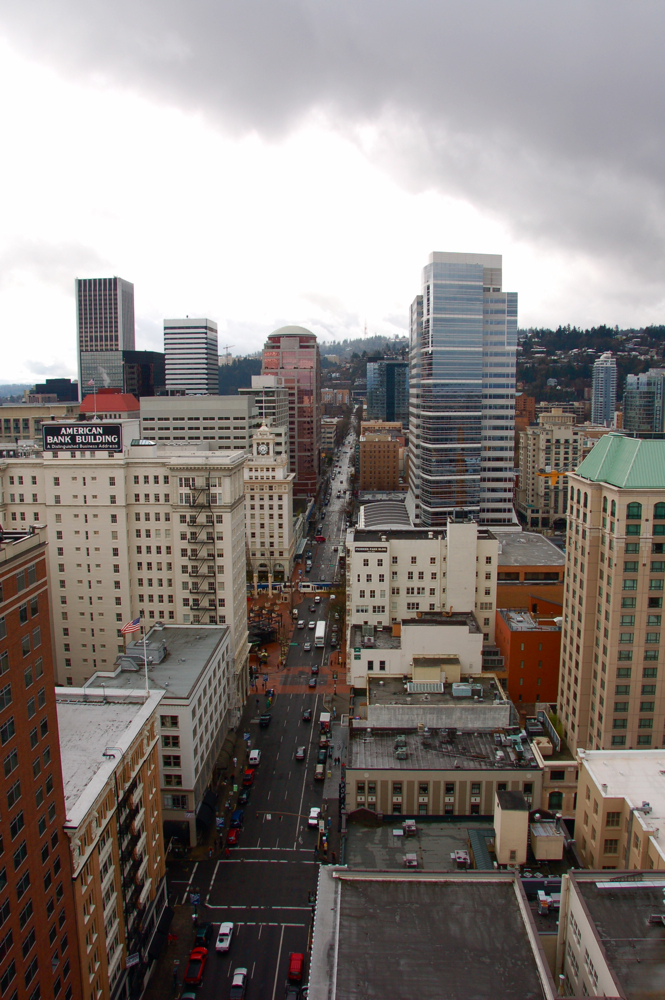
I was lucky enough to get a tour of the building from the manager, Dan, who was a friendly and patient guide (patient in the sense that he was on his lunch break). When you step inside the bank lobby, you are at once struck with a feeling of reverence: the hushed tones, soaring 24-foot high ceilings, tall windows sending in shafts of light, and wonderful attention to detail and use of materials. I had to turn off the knowledge that I was standing in a bank lobby devoted to the glories of capitalism and simply appreciate the space for what it is. The rest of the tower was equally impressive, including the views from the roof. I found myself imagining a living space on each floor (the actual footprint of the tower is very small, making for nice interior spaces unimpeded by columns), with some sort of roof garden up top. Maybe someday. Currently it is all office and telecommunications space. There is also a very cool interior courtyard on the first floor with a fountain that looks like a giant mushroom --cool, but also further evidence of a building that has turned inward from the street.
In closing, I would vigorously argue in defense of preserving this building if need be (and with the mid-century Memorial Coliseum across the river threatened with demolition, you never know). I would also support and encourage some sort of renovation that would bring the ground level back into a relationship with the street. Overall, I enjoy the way this tower contrasts with its surroundings and stands representative of the era in which it was built, for good and bad. It certainly is more compelling than some of the bland and uninspired boxes that sprouted up around downtown in the 80s and 90s, right?


3 Comments:
you're in school?
elegant writing and compelling photos
Yes, I have been taking some classes in my extremely limited amount of spare time.
And... thank you.
Nice to be reminded that I'm not doing this in a vacuum.
Post a Comment
<< Home